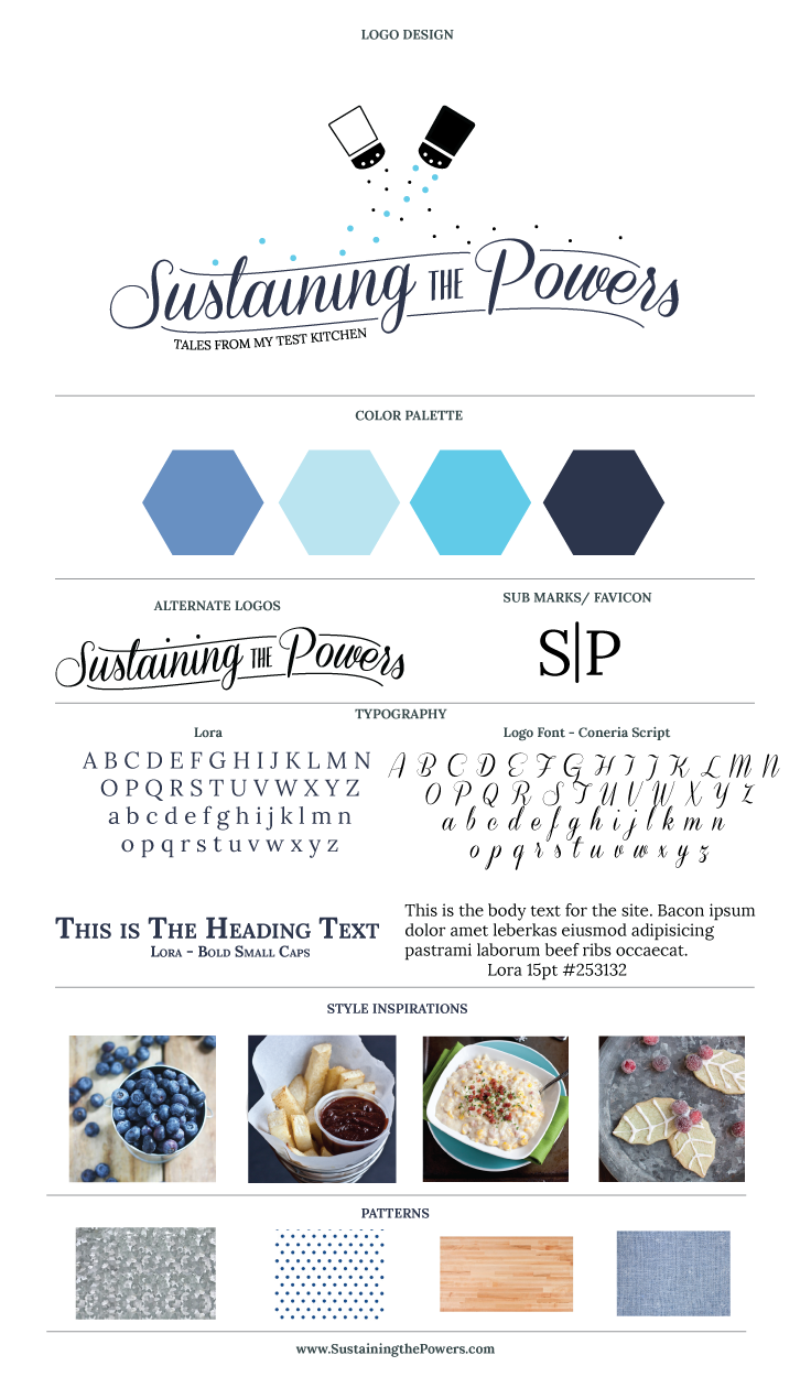
Welcome to the new look of Sustaining the Powers!!

It’s currently 1am where I am, and I’ve just now finished re-vamping Sustaining the Powers with an all new look! This plan has been in the works for almost a year, but I’ve been SO busy re-designing websites for other people that I’ve neglected my own little corner of blog land. With the recent updates of WordPress, my old theme design was breaking left and right (especially on mobile!) and I decided enough was enough, so this needed to become a priority.
I’m sneaking this site launch in before it’s 100% finished, so please comment, tweet me, or send me an email if you notice anything out of whack or broken. Expect to see a few more tweaks in the next few days as I finish up a few last things that I’m just to sleepy to finish properly now.
I’ll update this post when I wake up tomorrow with the meal plan and a tour of some of the fun things I’ve added to my new design!!
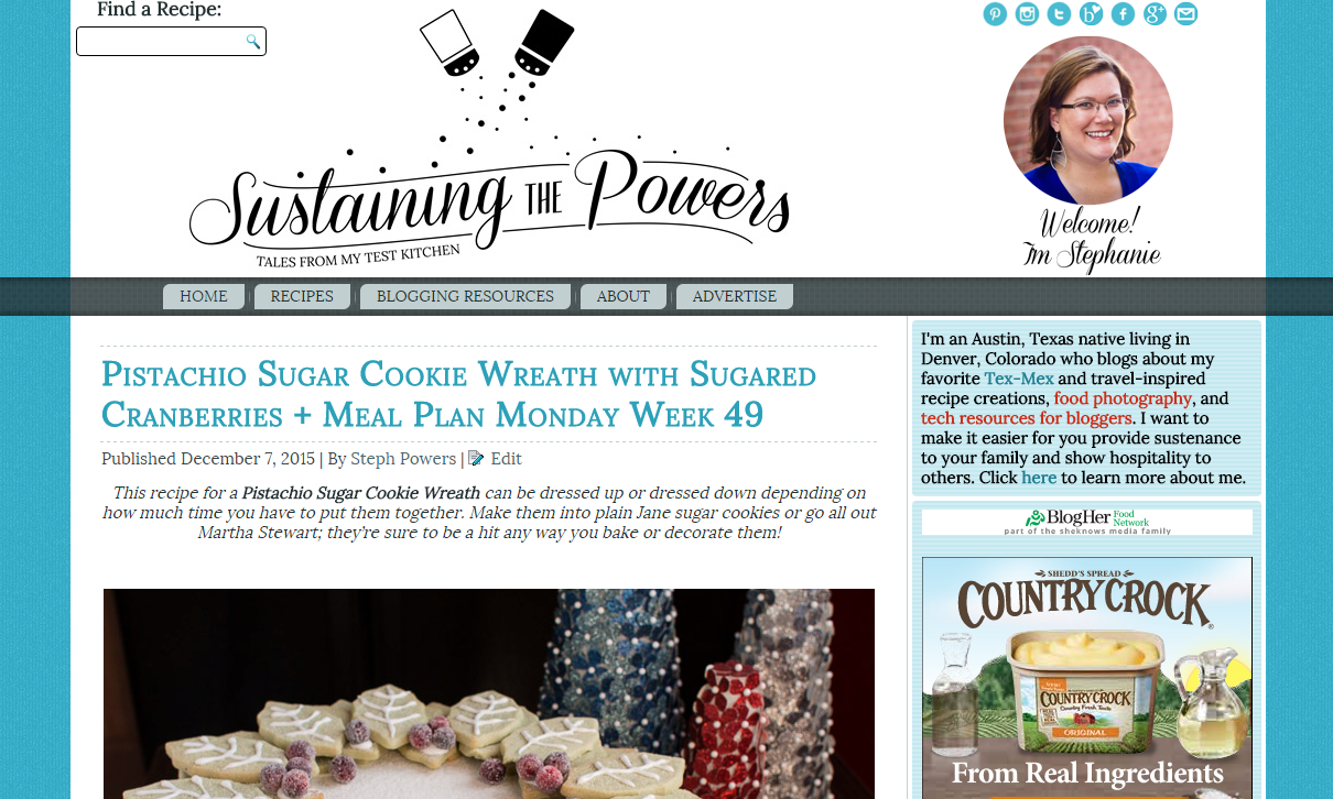
Here’s the Before:

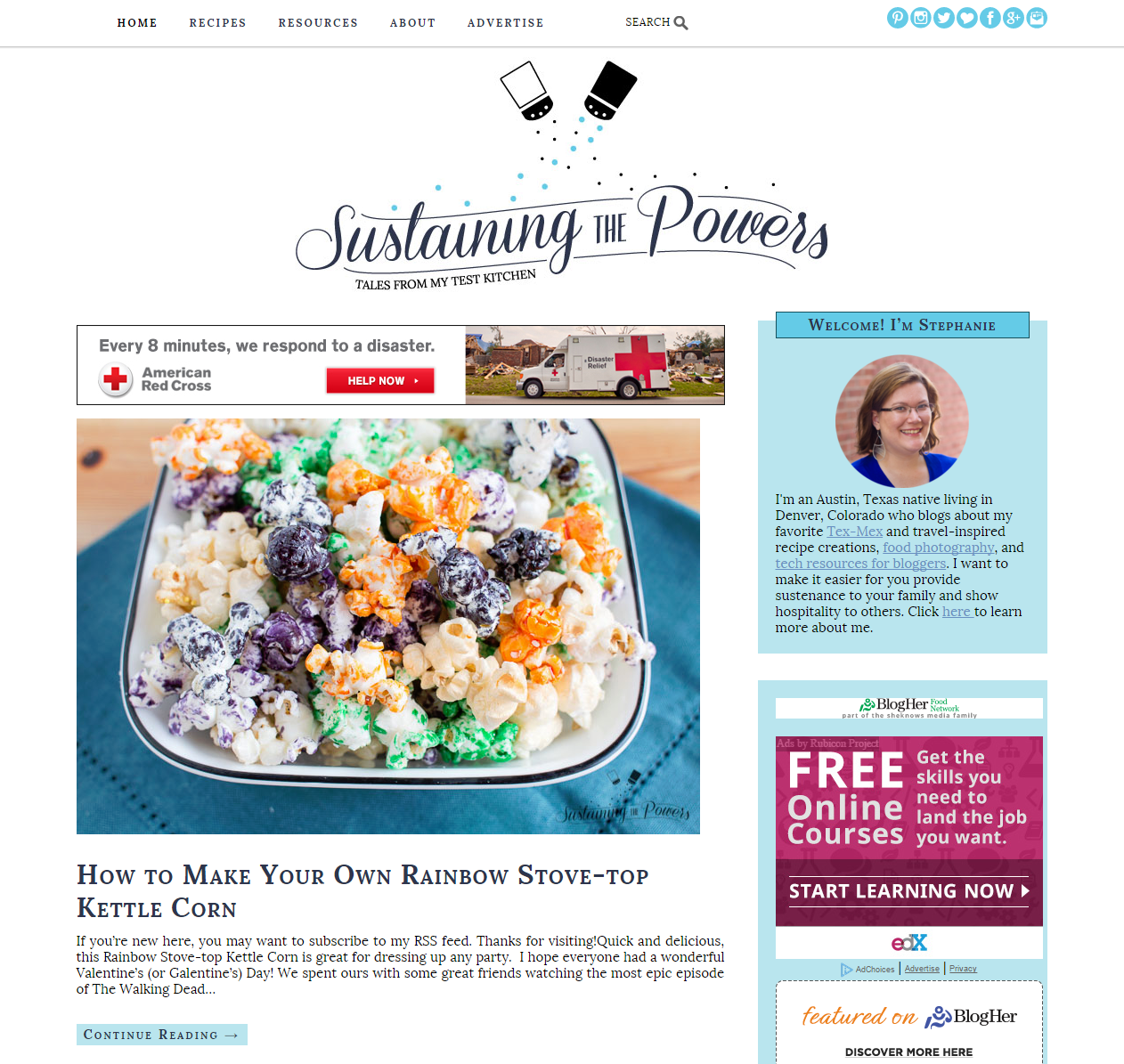
And the After. Much cleaner!

What do you think?


I love the new design, especially how much of a difference it made to remove that black menu bar. I’ve always loved your header, but the blue pepper just makes it even better.
I love all the little details! I love that the nav bar is always on top! It feels so clean! 🙂 Great job!
Woohoo congrats girl! I am loving the updates. It looks fresh and simple which I am all about. I can imagine it is tricky to dedicate time to your own blog design when you are so busy working with others. Way to go, I love it!!
It looks beautiful!
I love this so much!!! It is beautiful!!